Businesses need maximum exposure to get higher sales.
As if you don’t know that already. But let’s proceed…
There are lots of ways to do that. But one of the best methods is by creating your own website.
Not only does it promote your brand to more people. It also makes it easier for potential clients to become actual ones.
But here’s the thing:
Creating one is easier said than done.
Thankfully, we’ll show you how to design a website for your business in this post.
By following the proven and effective tips below, you should improve your profitability and reputation of your business!
Let’s go!
Table of Contents
Start With A Platform That You Like

There are lots of platform choices you can choose from; WordPress and Squarespace being two of the most popular CMSs around.
However, it’s ultimately up to you to decide which one to use based on your needs and preferences.
For example, WordPress is great if you’d want a customizable and user-friendly platform because of its many ready-to-use templates.
However, it’s not the best choice when it comes to security because its open-source nature makes it vulnerable to hackers.
Squarespace, on the other hand, has a strong support and maintenance team but is a bit pricey.
So what now?
Personally, it is best that small businesses should start simple by using website builders instead.
They don’t offer the headache that most platforms have.
More importantly, you can easily create a site by dragging and dropping elements using its intuitive editor.
In fact, you don’t need experience in web design to create a beautiful website using these builders.
But, you’ll need a helping hand when designing a compelling website for your company. What you need is a reliable unlimited graphic design service to help you with your website.
Focus On The Substance
Your offer should be the first thing visitors see on your site.
However, that’s not the case most of the time.
Business sites show sliders and carousel of blog posts and unclickable images above the fold.
While this looks good from a design perspective, it doesn’t offer a lot of value to visitors.
I’ll just say it:
They make for bad user experience!
Customers also look for solutions, not a product or service. And definitely not your mug hogging the screen!
Therefore, give value by showing what you can do to solve common problems your target audience have.
Make them understand what they’ll get the second they open your site.
By being clear from the get-go, you can attract paying customers to your business!
Make Site Load Faster
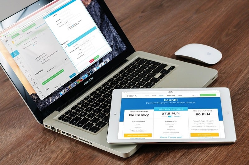
A slow site is the fastest way to make visitors leave your pages.
You also don’t want to test your visitors’ patience by making them wait.
This creates a bad first impression and wastes earning potential.
From an SEO perspective, site speed is one of Google’s main factors in ranking for SERPs!
If your site is loading slow, then your ranking will plummet until you’re overtaken by faster and better sites!
As you can see, site speed is a human and machine issue. You need to appease both if you want to increase conversions.
So make sure to observe the best design practices to decrease your site’s loading time!
For starters, check out Google PageSpeed Insights tool to know how your site fares when it comes to loading time.
This tool provides info on how long it takes for your site to load in desktop and mobile devices.
To avoid slow loading times, you can also shift to a faster web hosting service such as InMotionHosting and SiteGround.
You can also cache your site and minimize HTTP requests. Compressing media files also helps.
Prioritize Mobile-Readiness
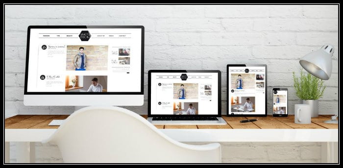
Design a site optimized for tablets and smartphones as 67% of the world’s total online population prefer using mobile devices.
A Duct Tape Marketing report also states that 70% to 80% of potential business clients use mobile devices. Websites should be responsive and quickly adapt to the visitor’s screen size.
Now, most websites nowadays have a responsive design.
It means that the site adjusts to the screen of the device visitors are using – whether the device is a tablet, smartphone, or CPU
But what if your current design isn’t responsive?
Here’s where mobile plugins such as WPtouch and JetPack come in handy. They use a simplified and compressed theme of your site that’s perfect for mobile devices.
You can also create a separate mobile version of your site.
Just make sure that it contains the same content and features of your original desktop site.
Test And Measure Your Calls To Action

Analyze how your CTA performs and creates the best one for your site.
Once see how many people click on it and convert into clients, create a different and better version. Then observe if it fares much better.
You’re doing this for a single reason:
To get more people to click on it.
Therefore, make your CTA specific and valuable.
Avoid generic statements such as “subscribe for updates” or “register now.” What updates are you giving or why do they need to register now?
Instead, create CTAs that offer solid benefits such as “get a free e-book” or “call us today for a free quote.”
Make the button where the text is found attractive as well.
Lastly, place it in the right place, but don’t come to a point where it’s annoying to visitors. Great areas to place them are above or below the fold.
Conclusion
I know what some business owners are thinking:
Web design isn’t that important! As long as the site works, then it works!
You see, things aren’t as simple anymore.
You need to consider different variables that affect the performance of your website.
Let’s say your site is attracting leads and clients left and right. That’s actually pretty cool.
But ask yourself this:
Can I make it perform better?
If your answer is a resounding “YES,” then you need to work on your site’s web design!
If you don’t have a site yet, make sure to work closely with a designer to achieve the look you want.
There’s always room for acquiring more leads and sales. And it starts with how your site looks and feels.
By following the tips in this post, you should have a good idea on how to approach your site’s web design.







CJB you nailed down all the basics. Putting just a little thought into designing your site makes all the difference.
Ryan