If the design of your website or your blog is not good enough, it is very likely that you are going to face one of the following two situations.
First, if you are a brand or an SME, you are losing opportunities to do business. This is translated into potential customers running away from your site, because it does not give sufficient guarantees about your reliability.
Second, if you are a professional who is on the internet to make personal branding or if you are a marketer who has set the goal of earning online, you are giving a bad image of you and you are not taking care of your best interests.
To make it short: the design of your website or blog is essential to reach the goals you want to achieve from your online presence.
Any error in web design has an impact on your credibility and your ability to get good results through digital marketing.
If you have a website with poor layout, then you should consider a brand new dress for it!
Here, there are five important points to keep in mind when choosing to improve or create a new website design.
Table of Contents
1. Loading Time
One of the vital parameters for your website is the loading speed of its pages.
More precisely: it plays a key role in influencing the user experience of your visitors.
For example, it is known that 40% of the web users leave a page that takes more than 3 seconds to load.
The average time that visitors to a website are willing to wait for the loading of your site is only 2 seconds.
Hence, the increase of web traffic on a blog is related to the loading speed of its pages.
This has also reflected in the bounce rate: slower web pages have in fact a higher bounce rate.
2. Color Scheme
The colors you choose to use on your website have an impact on the results you get on your visitors.
More precisely: green and blue are connected to an increase in traffic of 3% and 2%, while it seems that red is connected to a loss of 1.3% of traffic.
Among other things, it has been proved that sites with a layout that includes a combination of dark colors have a 2% more of web traffic.
Instead, those who have a layout with a combination of light colors have a minor increase in online traffic, estimated at 1.3%.
3. Layout
You need to think well about how to organize the layout of your site, most of all the part above the fold.
What else can be said?
A good web layout really matters, because increases your customers and readers perception, at the end.
Hint : the average online user reads web pages by drawing an F with eyes, so be sure to organize your site according to this statistic.
Also, the visitors normally focus on the first two paragraphs of the content of a website pages – and that’s why is convenient to use online the method of the “inverted pyramid” (which means explaining the main topic in the first lines of an article).
Many times, online readers simply scan the subtitles and bulleted or numbered lists of a content (I do the same sometimes).
4. Trust
The design of a website has a strong impact in determining the trust of visitors.
In this sense, as many as 94% of the people who surf the internet mention bad design as a sufficient reason to have low confidence in the content they find on that specific website.
So, how can you increase the perceived authority in respect of your blog?
There are some points you should keep in mind :
– increase the number of links to and from authoritative sources;
– show the logo in the pages of your site and indicate which are your main customers (create a “testimonials” page);
– display the numbers of followers and fans of your Twitter, Facebook and Google+ business profiles;
– avoid ready-made templates (or at least make some customizations at the end).
5. HTML5
It has been proved that sites which make use of HTML 5 have major advantages, in terms of a greater number of page views, which can even double since when you start using it!
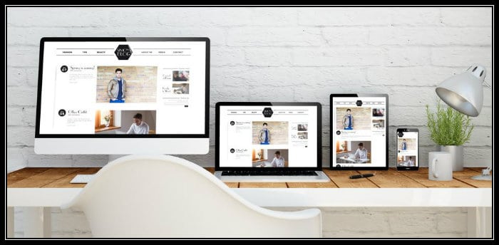
Therefore, you should think about adopting HTML 5 as soon as possible, as well as a mobile responsive theme.
I have updated NoPassiveIncome blog to Genesis Framework since two months already, using a personalized Magazine PRO child theme, and I am surprised of the results in terms of ROI, users experience and increase of traffic.
Conclusion
These are five of the several reasons why you should change the design of your website or your blog, if it is outdated.
Remember: think carefully!
If you leave it as it is, in the long term you can say goodbye to your strategies, personal branding, lead generation, online sales etc.
At this point, this is your turn.
Take action now or fall behind the progress of technology and web design.
What do you think?
Do you have a mobile responsive and HTML5 design on your site?
Please share your views in the comments below, thanks!







Hi Erik,
Trust and load times are biggies. If I am waiting, I bolt, and I like to see credibility, with a bought domain, and some nice social proof, to stick around for more than a few moments.
A few basic tweaks here and there and you will grow your traffic, and boost your blogging income.
I decided to build a quick loading, clear, clean site, with just my eBooks, travel images and 1 affiliate ad on the sidebar and my user experience improved overnight.
Thanks so much Erik.
Tweeting through Triberr.
Ryan
Good points, Erik.
Those were interesting statistics about the colours. It seems that the key is having a combination of colour, but not too much. Plenty of white space definitely helps too.
You’ve done a good job with your site.
Nathan.
Hi Erik,
Indeed the design of a website/blog affects its success. Any design that does not improve user experience will affect the success of the site.
Increased load time, poor layout, and poor navigation, etc should be considered by bloggers and designers that intends to increase the success of their online business.
The 5 reasons shared here are spot-on.
I completely agree that if a blogger is experiencing these issues then it is better to switch to a design or theme that would bring about good engagement and improved user experience.
I left this comment in kingged.com where this post was shared.
Hi Erik,
I agree with these 5 points that you mentioned.
If the loading time of our website too long will cause the readers move to another site that has a shorter load time, since most readers are busy people with hectic schedule. Indeed, the design and layout also affected. I have no doubt about it.
Thanks for sharing this with us, Erik.
Nice share!
Keep up the hard work and hope to see your around. 🙂
Regards,
Nanda
Changing a website design is most crucial part of blog/website and we must always choose an attractive design.
Hi Erik. This is a very informative post. My blog just underwent its 3rd renovation, and I’ve worked pretty closely with a coach on it. It is important to keep those things in mind. You have a very nice blog here. I’ll be back to visit. I featured this link in my weekly magazine, Thanks so much for sharing your thoughts.
All the best,
Leslie Denning, The Home Biz CEO
Heyy Erik,
I was unaware that our website layout plays an integral role on our site traffic. You shared some new things like “Fstatistic” which amazed me very much. Going to implement it right away!
Thank God, I am using HTML5 built template ! 🙂
Thanks, Truly appreciate your efforts 🙂
Hi,
Wonderful article my friend.
Website design is the basic thing any new visitor sees, thus it is the first user experience. If it is bad then the whole impression will be bad.
You explained the bad design very aptly.
Recently website speed have become the biggest checkpoint to consider. Nice article.
Have a great weekend. 🙂
Hey Erik,
Good stuffs. I used red for hyperlink for nearly all my blogs. I don’t know, just me!
Having blue ones are probably the worst for mine and guess what? My readers tend to enjoy more of the black and white colour of my blog (like yours here) more than anything else.
I even received emails from them saying minimalist would fit best for me. And yes, my fiancee thinks that too 🙂
Good explanation in the colour part man. HTML5? Yup. Don’t forget that!
*PS Mobile is also important man.
~Reginald
Hi Erik,
The points you have discussed were really great..Yes if we need to get sucess in online business then we need to consider certain factors as you mentioned.. keep sharing such amazing posts
Hi Erik,
You really point out some great clause about Website Design. All points are really important to build an effective website that covert visitors into client.
As a web designer, when I design a new website, I always careful about website layout and color schema.
I have used Daily theme from theme junkie which was good but that was not responsive and I wanted it to be more spacious. I loved the theme but something was missing. I tried to code CSS and made it broader + responsive myself and now it looks cool.
I feel the loading speed is the thing I have to work upon now.
Thanks for the nice post Erik
Thanks Erik. That was just a try. It took 1 week to understand the things and make it look like this. 🙂
Hey Erik,
There are really so many reasons I won’t stay on someone’s blog but my #1 pet peeve is loading time. There are several blogs that I just really love to read but my goodness, it just takes forever for them to load. I’ve let the owners know but they’ve not done anything to resolve the issue. I’m sure they are really losing a lot of readers because of this.
I haven’t run across any wild and crazy colors or themes in a while now. I think people are getting smarter about that. Gosh I hope so at least.
The layout, most of the ones I visit they are all the same which I find easy to read so that’s not been a problem.
The trust factor, big one there my friend and because of the loading time that I just complained about with a few of my friends, because we’ve built that relationship and I trust them I’ll continue to visit.
I know nothing about HTML 5, that’s a little over my head but all else is good. I’m happy with my traffic and on page visits. I know there is always room for improvement though right.
Appreciate the share and hope you’re having a really good week.
~Adrienne
Thanks for the appreciation Erik. I am glad that you liked it.
Having a mobile responsive site will certainly increase web traffic as more with the increase in use of smartphones. Having a well designed and functional site will will surely attract more prospective clients.
Ciao, Erik,
This is a great article, and I resonated with many of your points.
I completely agree with the elements you mention, and quickly click off of the site if it takes a long time to load. Who has time for that? I’ve seen some bold and flashy colors lately, and I’m not a fan, that’s for sure. I also click the back button extremely fast in this situation.
Trust is a huge factor for me, and I can tell within five to 10 seconds whether or not I’m interested in this person based on the vibe I get when landing on their site in viewing everything visually.
Layout is definitely a huge component that I put a lot of weight on myself. I strategically place certain elements in specific locations so as to increase and encourage visitor flow and conversions, whether it be subscribers to my list or purchases.
Great content, keep up the good work.:-)
Sharing with friends…
– Carol
Great job Erik,
Website design is the first impression of any site. Therefore it plays most important role in building authority and trust from the visitor. You said to avoid ready made templates. I really agree with your point but for the newbie bloggers there is no way without using ready made blogs.
Thanks –
MSI Sakib
Hi Erik,
Great points you’re making.
Fist off, I know that my blogs could load faster, just nothing I can do about this at this. Hopefully it will get better when I get a new design.
As for the colors. I have one red, one blue and one green and in my case, it’s the red that wins, and I also know many big bloggers whose sites have red headers like mine and do great with traffic, however, I do know that we are influenced by color, so that’s something to consider.
I have no idea what HTML 5 is, but I’ll check that one up.
Thank you for bringing those points up. Very important to put as many positive factors on our side to attract more traffic.
Hi Erik,
Yes I’ve a responsive theme 😀 It’s working well even if I’m using from phone or from laptop.
I think the biggest issue one comes in front is to not having a user friendly or mobile friendly. Some themes take a longer time in loading this is another cause of changing theme.
By the way this post is amazing. I’d found your blog on donnamerrill tribe where she’d mentioned you on their list of amazing bloggers. I’ve also great infographic of website theme on my blog too. But, this post really help me to know more 😉
I’ll visit soon to know more tips 🙂
Great Insight Erik,
The way we view websites is changing like never before. Website design is a decisive factor for building trust with online consumers. A custom, high-impact, user-friendly business website design will not only increase customer loyalty and engagement, but help convert new leads to loyal customers by presenting a professional brand image.
Html5 has a ton of potential for advancement to be made in the web; however one needs to understand the patterns of the markup language before structuring or presenting content with it.
Well, few days ago my blog’s design also sucked but than I came upon an article where I read that your website design really matters in SEO and gathering visitors so I generally stepped back quickly grabbed some money and bought some cool and attractive yet SEO friendly themes for my blogs which are working well now.
Your post was very amazing Erik, keep writing!
thanks this after read this blog no buddy have to think more about the design and layout of the website.
Hello Eric Your ideas is great for SEO friendly website and blog. I would like to raise the issue of layout that should be responsive – Responsive design has a boatload of positives and opens the door to content parity across multiple devices. One of the difficult parts about it is when you’re serving the same code base up to both a 27-inch Thunderbolt display on a broadband connection and to a 3-inch screen on with a 3G connection on two bars. You have to understand the two different contexts and make sure you are doing your users some favors based on what kind of content you are loading for each experience.