The effectiveness of a logo depends on its ability to express the entire soul and essence of the company.
A true, iconic logo should be simple, appropriate, distinctive, durable, adaptable, and with the right colors. It must communicate something.
So, are you ready to build the perfect logo for your business?
Be sure to read the following essential rules, for the creation of a killer logo!
Table of Contents
1. It Must Be Simple
Focusing on simplicity allows you to get something that is easily recognizable and identifiable.
In a logo, each element must have a meaning and a precise role. No unnecessary decorations should be inserted. Things like doodles, arrows, circles, or lines, if they don’t make sense, have no role in the design.
One of the simplest and at the same time most effective and brilliant logos of all time is, according to me, that of FedEx, designed by Lindon Leader in 1994.
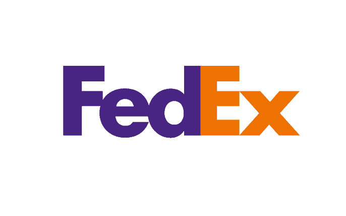
This logo, actually a rebranding of the previous “Federal Express”, aims at the most extreme simplicity. The same name is abbreviated for simplicity.
But have you already noticed what is the brilliant thing about this logo?
Inside, it contains the whole meaning of a company that deals with transportation and distribution. Yeah, there’s an arrow, obviously wanted:

A simple, concise arrow to the right transmits dynamism and speed. Speed, how fast are FedEx deliveries? Fantastic.
One of the most beautiful and intelligent logos ever.
2. It Must Be Appropriate
An effective logo must be adapted to the public with which the company will have to interact, obviously. Not only that, the logo must also be consistent with what the company wants to convey and with what it offers and sells.
Are you designing a logo for a lawyer? Then probably a “funny” logo is not adequate.
Logo for a vegan restaurant? Maybe it’s better to avoid drawings with chicken legs and steaks.
The bright colors and the most childish details will be good for a company that deals with the production of toys for children or for a store that sells this kind of product, but they risk being absolutely out of place in any other context.
The logo chosen must be consistent with what it represents, but without necessarily having to show the main activity of the company. For example, the Apple logo does not represent a computer, as do those of Audi and other car manufacturers: they do not represent a car.
3. It Must Communicate Something
A good logo should not only be beautiful, but it must also be able to tell a story.
In its simplicity, the Amazon logo, for example, tells a story: the logo arrow goes from a to z. That is: on Amazon, you can find everything, from a to z.
Simple, effective, and with a history behind the company.

4. It Must Be Versatile
A logo must be versatile and adaptable to any shape or surface (or at least on most). It must be able to be printed on a business card or on a 30-meter-high trampoline without losing consistency and value.
What does this mean in practice?
It means that when designing a logo you have to consider all the potential applications. How will it be used? Which surfaces will it be printed on? Will it be used only online or on screens?
Based on this, the design must proceed accordingly.
For example, creating a logo that uses only shades of colors can work great on screen but results are completely ineffective once printed. It cannot be printed in black and white, engraved, sewn, embossed, etc.
A great example comes from the designers who worked on the Instagram logo:

5. The Right Colors Must Be Used
What is the meaning behind the logo colors?
Logo colors have meaning, when we see the blue color we associate it directly with wisdom, loyalty, mystery, and respectability; red instead is connected to energy, romance, love, and comfort; green to tranquility, health, and nature. By using these colors in the right context, you can get an impacting logo!
A suitable color combination will also be a further step forward. For example, if we are making a logo for a nursery, it will not be advisable to use just black!
It will also be important for the font to fit the message you want to convey. Therefore, a combination of light colors (for example white, which is connected to hygiene, youth, and innocence) will convey a feeling of purity and will certainly be suitable to represent the identity of a nursery.
The shape of the logo is another important element. A complicated form will put people in a difficult position and it will also become difficult to see the design and the message behind the logo.
6. It Must Be Durable
When you are called to choose the logo of your brand, there is no trend that holds.
We must not let ourselves be carried away by the trend of the moment but aim to achieve something that can preserve uniqueness and originality even twenty years after its creation.
A logo design cared for by a professional in the field, in fact, does not fear in any way the passing of time. A case in point?
The Coca-Cola logo, is still current today more than ever, yet created as far back as 1887.
7. It Must Be Easy to Remember
You have to design a logo. In this regard, it could be useful to use decorative elements linked to your business. Ideally or culturally connected to the company they are part of. Does the brand have a very simple name to remember? It could be chosen as a logo.
This is the case with multinationals like Apple, and Google. After choosing the symbol, it will be appropriate to dedicate oneself to the design that must be original, provocative (the latter is a great way to remain impressed in the consumer’s memory), and able to offer an emotional impact.
Once again, simplicity is the key to logo design. In creating a logo, we should take into account the mnemonic value of the human being, which will make it memorable and quite distinct from the others.
Final Words
We focused on the essential aspects, but the list of rules for creating a good logo could go on and on.
Never copy from others and do not expect perfection are other two other good suggestions and in the meantime, we look forward to your opinions too!
Please share them in the comments below, thanks!








Erik,
Great Ideas. Even, my self noticed the ‘arrow’ in the FEDEX logo recently (say a few months ago, from a blog post). Thanks for the ideas to understand how a business logo must be. It’s worth reading for both logo designers as well as businesses.
When I created the logo for my website, I wanted to incorporate my face into my logo so that people could see who was the face behind the blog. I used a template from Canva, and inserted my face into the perfect spot on the logo, and figured this will help to a little bit of trust, personality, and credibility from the people who read my blog posts.
Hello Erik,
Thank you for your article, it was very informative. I have been meaning to try and follow some of the tips mentioned, and I have already implemented a couple of them. I would highly recommend this article to anyone looking for a great business logo.
Hello!!
Useful blog. thank you for sharing to us.
Hello Erik,
Thank you for your article, it was very informative. I have been meaning to try and follow some of the tips mentioned, and I have already implemented a couple of them. I would highly recommend this article to anyone looking for a great business logo.
Erik,
Great Concepts. Even I recently (say, a few months ago, from a blog article) became aware of the ‘arrow’ in the FEDEX emblem. Thank you for providing examples of what a company logo should look like. Business owners and logo designers should both read it.
Hello Erik,
Thank you for your article, it was very informative. I have been meaning to try and follow some of the tips mentioned, and I have already implemented a couple of them. I would highly recommend this article to anyone looking for a great business logo.